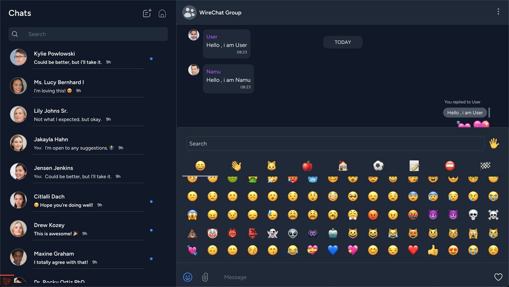
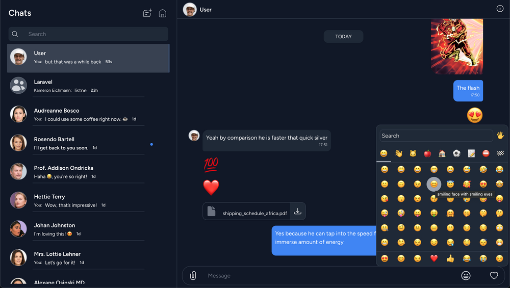
Which emoji picker layout would you prefer to use?
Layout 1 - Fixed at the bottom 
Layout 2- Floating in corner
Any ideas?
small popup. I don't like all my interface to move up and down to accomodate the emoji picker
Good point. A small popup keeps the interface stable. I'd have to use absolute positioning to make the Layout-1 work in a similar way to the small popup . Thanks for the input!
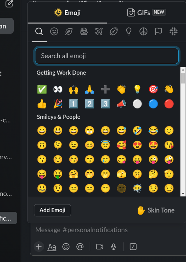
If you need an example of a good emoji picker, I find slack to have a good approach  but whats app web on has a wrong approach where when opening the emoji picker it moves all the content up and display a small horizontal emoji picker. this way the amount of shifted stuff is the maximum possible
Yes i noticed that . initially i followed the whatsApp-web approach of pushing content up, but when i checked WhatsApp-desktop app , it was using the floating emoji picker in the right corner, so now i am to trying figure out which approach to go with .However since this is a package i am thinking to just make it an opt in feature to choose floating or stacked layout

