CSS Flexbox Basics – Create a Responsive Layout.
📌 Flexbox makes building responsive layouts easy!
📌 Align, justify, and distribute items effortlessly.
📌 Great for creating dynamic and flexible UI structures.
1️⃣ Setting Up a Flex Container
Define a flex container using display: flex;
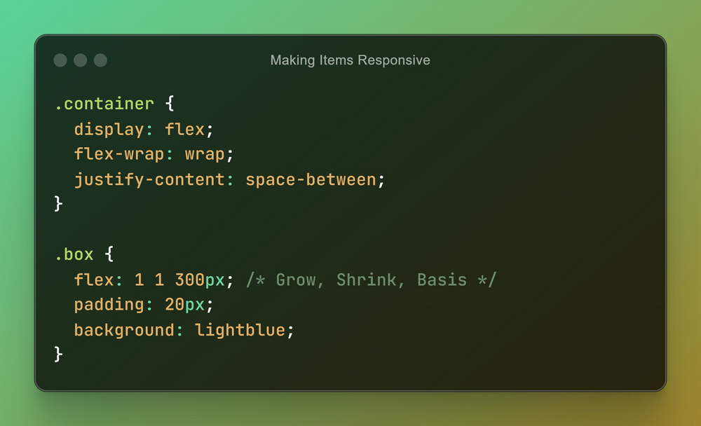
2️⃣ Making Items Responsive
Use flex-wrap to handle responsiveness.
And that’s it! 🎉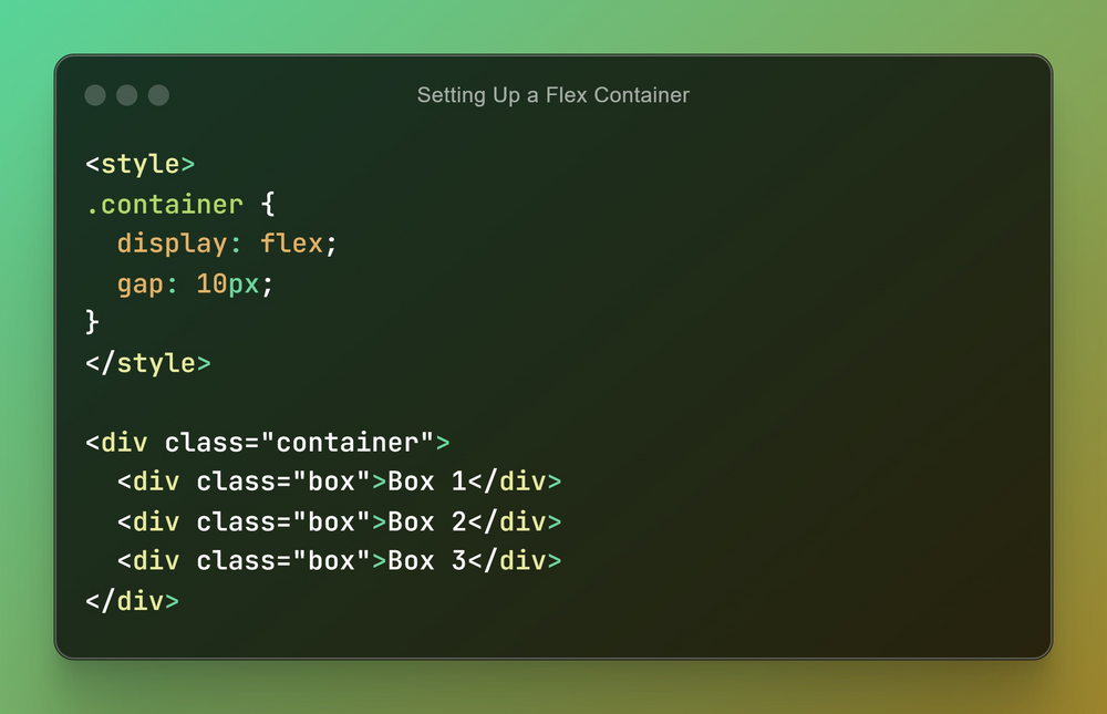
Check some Interesting Laravel Articles here: scriptbinary.com/topic/laravel
And that’s it! 🎉
Follow @thescriptbinary for more web development tips and tutorials! ✨💻
#WebDevelopment #coding #PHP #Laravel #JavaScript #CSS #LearnToCode